Balancing Accessibility & Compliance for NDIS Website Design
Designing a website for an NDIS provider isn’t just a branding exercise.
It’s not just about ranking on Google…
It’s not just about looking professional…
And it’s definitely not just about adding a Privacy Policy in the footer and calling it compliant.
For an NDIS business, your website sits at the intersection of marketing, safeguarding, participant rights and accessibility. It shapes your online presence, influences how NDIS participants and support coordinators perceive you, and often determines whether potential clients take the next step.
Get it right, and it builds trust.
Get it wrong, and you risk confusion, exclusion or unnecessary compliance pressure.
Let’s unpack how to balance both accessibility and compliance, without turning your website into a 300-page policy document.
Interpreting the NDIS guidelines for website design
There isn’t a single line in the NDIS Practice Standards that says: “Here is your website checklist”.
But there are clear obligations that flow directly into your digital presence.
Here’s what that means in practical terms.
1. Clear service information
Participants must understand:
- What supports you provide
- How they’re delivered
- Who they’re for
- How to access them
If your website says “tailored supports for individual needs” and stops there, that’s marketing fluff, not compliant clarity.
A professional website for an NDIS service should clearly outline your service types (SIL, SDA, Support Coordination etc), intake process and what participants can expect. This is particularly important for a small business entering the NDIS space, where clarity can be the difference between enquiry and exit.
Clarity reduces risk. Vagueness increases it.
2. Participant rights
Under the Practice Standards, participants must be informed of their rights, including:
- Choice and control
- Dignity and respect
- Privacy
- The ability to raise concerns
Your website should visibly reflect this. Not buried in a PDF. Not hidden behind a login. Plain, accessible and easy to find.
3. Complaints process
An accessible complaints process is mandatory.
Your website should:
- Clearly explain how to make a complaint
- Offer multiple contact methods
- Acknowledge the option to escalate to the NDIS Commission
- Reassure participants they won’t be disadvantaged
If someone has to hunt through your website to figure out how to raise a concern, that’s a problem.
4. Privacy and data handling
If you’re collecting participant information online, you must:
- Have a compliant Privacy Policy
- Secure your forms (SSL encryption)
- Clearly explain consent and data use
Sensitive disability information deserves careful handling (both legally and ethically).
5. Accessible information
The Practice Standards require information to be provided in a way that Participants can understand.
That means:
- Plain English (or translations available for services provided in alternative languages)
- Clear structure
- Logical headings
- Avoiding unnecessary jargon
- Information provided in a way that screen readers can understand
Compliance isn’t about sounding formal, it’s about being understandable.
The importance of website accessibility
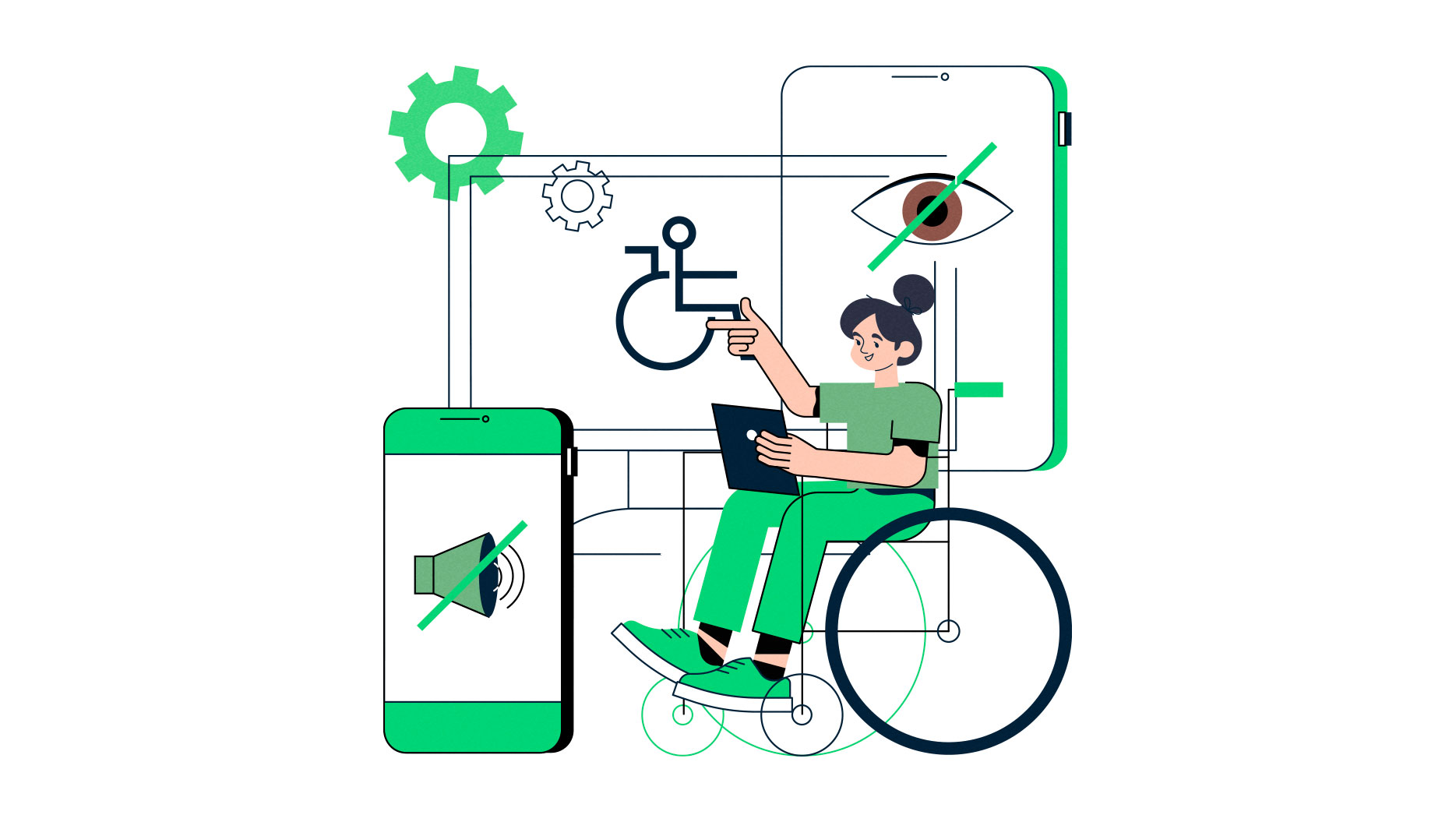
Here’s the uncomfortable truth – if your website isn’t accessible, you are excluding part of your audience.
NDIS providers serve people with:
- Vision impairments
- Hearing impairments
- Cognitive disabilities
- Neurological conditions
- Physical impairments affecting device use
An inaccessible website sends the wrong message before someone even picks up the phone.
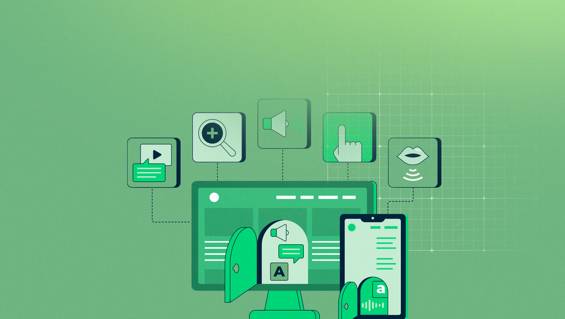
Best practice digital accessibility aligns with WCAG 2.1 / 2.2 Level AA standards. In practical terms, that includes:
- Strong colour contrast
- Keyboard-friendly navigation
- Screen reader compatibility
- Alt text for images
- Clear form labels
- Logical heading hierarchy
- No flashing or distracting elements
When you invest in NDIS web design properly, accessibility isn’t an afterthought. It’s embedded into the way you build websites from the ground up.
Accessibility isn’t a trend; it’s paving the way for a better online future for everyone.
And, yes, it also improves SEO, reduces bounce rates and makes life easier for support coordinators.

Website design for NDIS businesses
Here’s where things get practical.
Most smaller NDIS providers fall somewhere on a spectrum. You might be:
- Good: technically compliant, but basic
- Better: audit-ready and participant-friendly
- Best: fully inclusive, WCAG 2.2 AA aligned, and future-proof
There’s nothing wrong with starting at “Good”. But if you’re serious about participant experience and long-term growth, you want to be aiming higher.
Let’s break it down.
WCAG Accessibility Foundations
Accessibility isn’t just about adding an accessibility widget and hoping for the best. It’s about structural design decisions.
Here’s how the tiers play out.
✅ GOOD (Minimum functional accessibility)
This is where many small providers sit.
You have:
- Mobile responsive design
- Basic readable font sizes
- Some colour contrast consideration
- SSL security
- Alt text added occasionally
- Simple enquiry forms
This level may work “well enough” for many users.
But:
- Colour contrast may not fully meet WCAG standards
- Keyboard navigation may not be fully supported
- Screen reader experience hasn’t been tested
- Headings may not follow a logical structure
- Forms may not have accessible error messaging
You’re not intentionally excluding people, but you’re not intentionally including them either.
👍 BETTER (Audit-ready accessibility)
Now we’re being deliberate.
At this level, your website includes:
- Consistent heading hierarchy (H1–H6 structured properly)
- Verified colour contrast ratios
- Full keyboard navigability
- Clear focus states on buttons and links
- All images with meaningful alt text
- Accessible form labels and instructions
- Clear error messaging that isn’t colour-dependent
- No auto-playing video or flashing content
- Captioned video content
- You’ve tested with screen readers.
- You’ve reviewed usability with real-world users where possible.
This level demonstrates that accessibility was considered in the build, not retrofitted later.
For many small providers, this is a strong and responsible benchmark.
⭐ BEST (WCAG 2.2 AA aligned & future-proof)
This is where accessibility becomes embedded into your digital strategy.
Your website:
- Meets WCAG 2.2 Level AA success criteria
- Supports assistive technologies across devices
- Includes accessible authentication (important for portals)
- Avoids time-limited interactions without user control
- Provides larger click/tap targets
- Avoids complex multi-step interactions without guidance
- Ensures consistent navigation patterns
- Has been formally accessibility tested
- Includes ongoing accessibility review as part of maintenance
This isn’t just about avoiding complaints. It’s about aligning your digital presence with inclusive service delivery.
If your organisation advocates for participant dignity and inclusion, your website should reflect that standard.
NDIS Compliance Essentials
Accessibility focuses on usability while compliance focuses on transparency, safeguarding and rights. There is an overlap, but they’re not quite the same thing.
Here’s our Good / Better / Best breakdown.
✅ GOOD (Basic compliance visibility)
At this level, your website includes:
- Service descriptions
- A Privacy Policy in the footer
- A general contact page
- A short complaints statement
This may technically cover minimum visibility expectations.
However:
- Service descriptions may be vague
- Participant rights may not be clearly explained
- Complaints processes may lack detail
- Escalation pathways may not be referenced
- Language may feel policy-heavy or unclear
While you’re meeting basic expectations, you’ll find it doesn’t actively build confidence.
👍 BETTER (Audit-ready transparency)
Now your website clearly demonstrates alignment with the NDIS Practice Standards.
You include:
- Detailed service explanations (what, how, who it’s for)
- A clear “Participant Rights” section
- Transparent complaints process with step-by-step explanation
- Reference to escalation to the NDIS Commission
- Clear safeguarding statements
- Plain English content throughout
- Secure and consent-based enquiry forms
- Clear explanation of how participant data is used
If an auditor reviewed your website, it would reflect structured governance behind the scenes. It communicates “we take this seriously”.
⭐ BEST (Compliance integrated into participant experience)
This is where compliance and accessibility meet.
At this level:
- Rights, complaints and safeguarding are integrated into onboarding pages
- Easy-read summaries are available alongside detailed policies
- Contact options include multiple accessible pathways
- Policies are written in participant-friendly language
- Website content reflects actual service delivery processes
- Regular content reviews ensure accuracy
- Accessibility and compliance checks form part of annual internal review
Your website isn’t just compliant.
It actively reinforces participant trust.
And for smaller providers, this is often where competitive advantage appears, because many competitors are still sitting at “Good.”

Dweebi’s experience with NDIS provider website design
We’ve worked with NDIS providers, both starting out and going through growth phases, with their branding, website design and performance marketing.
We understand that your website isn’t just a marketing asset, it’s a public demonstration of how seriously you take:
- Safeguarding
- Participant rights
- Transparency
- Accessibility
Our process is structured and methodical:
- Review your obligations under the Practice Standards
- Identify what must be visible online
- Restructure content for clarity
- Design with accessibility embedded from day one
- Deliver a website that feels human, not clinical
Compliant doesn’t have to mean cold.
Accessible doesn’t have to mean bland.
A well-designed NDIS website can be clear, inclusive, trustworthy – and still reflect your brand personality. If you’d like to see how we approach NDIS website design in more detail, you can explore our NDIS website design services.

read more!
recent posts
How to Create a Construction Company Capability Statement
Learn what makes a construction company capability statement clear, professional, and visually effective to make a strong first impression.
Digital Marketing Updates 2025
2025 was a year of big changes from AI to social media. Here are all the 2025 digital marketing updates you should know.
Shopify or WooCommerce?
There are two star players for ecommerce websites and the choice can be tough – Shopify or WooCommerce?
Read more about the two and find the choice that’s right for you.


